


Design with Monotone Colors
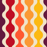
Monotone (or monochromatic) color refers to a color that utilizes a single base color in addition to shades, tints as well as tones of that hue. Monotone color begins with a unique hue, anything ranging from red to beige, and then purple. The monotone color design is created with a palette by making use of derivatives of that color.
When used correctly during design, monotone colors deliver a result that is smooth, elegant, and comfortable on the eyes. If you wish to hack your way through graphic design, then it is essential that you understand how color schemes can affect a product’s influence. However, it is critical to note that finding the right color scheme to use is no cakewalk, as it entails more than just picking a color and then creating and designing everything under its influence.

Things You Should Know When Designing with Monotone Colors
We have outlined some of the things you should know when designing with monotone colors. They include:
- Target Audience. Regardless of the efforts that you put into your designs, they end up being only as good as the approval that they get from your audience. Consequently, you should make it a duty to choose colors that make an impression on your intended audience. It is recommended that you use bright and bold color schemes, as they grab attention the most. With monotone colors, the colors you use usually depends on the product you are designing. For instance, if you are printing out promotional flyers, it is advisable that you gravitate towards vibrant hues that can appeal to people from across a room or draw the attention of a passerby. In the same way, if you are designing a brochure for a company, then it is crucial that you go with colors that get the brochure’s message across without distracting the reader. To achieve this, you should use bright (low value) font colors. This concept should also apply to any marketing piece that you create. Before you design any piece, first understand who your audience is, and then use colors that will attract them.
- Practice as much as possible. Unless you perfect the art of combining tints, tones, and shades of a single hue, designing with monotone colors can be a dull experience. Practice helps to equip you with the appropriate skills that you need to vary your designs in ways that appeal to the broader public. On top of that, it makes things all the more interesting for you as you experiment with all the possibilities. Besides, having shades and tints of one color that one can use for several purposes and effects over different pieces of collateral help to give their product a polished and unified look. Every product needs cohesive branding.
- Do not forget the importance of adding contrast, blending in, as well as keeping things simple. Contrast helps give your brand good visibility and makes it easier for a reader to navigate your design. And when properly blended, the right monotone colors can help make your design elements stand out. Also, simplifying and separating your designs enable your audience to tell one product apart from the other.


