A Comprehensive Look at its History, Applications, and Influence of Reflex Blue
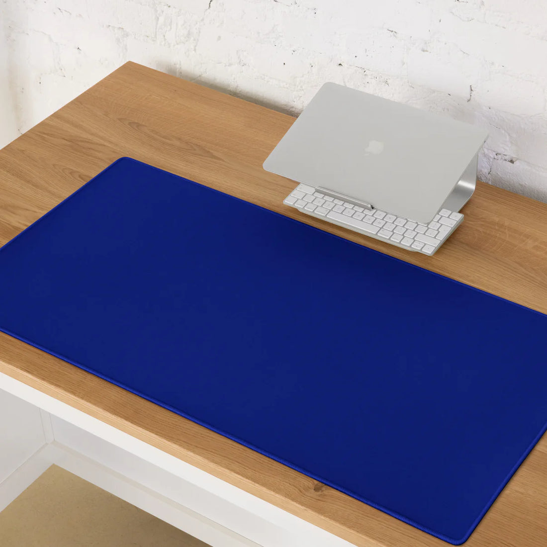
In the world of color, few hues carry the depth and intensity of Pantone Reflex Blue. Revered by designers, artists, and brands alike, this color exudes a richness that captures attention and evokes a range of emotions. In this blog, we explore the history, applications, and significance of Pantone Reflex Blue, highlighting its enduring popularity and versatility.
The History of Pantone Reflex Blue
Pantone Reflex Blue has a storied history within the Pantone Matching System (PMS), a standardized color reproduction system widely used across various industries. The Pantone Matching System, introduced in the early 1960s, revolutionized the way colors were identified, communicated, and reproduced. Reflex Blue quickly became one of the standout colors in this system, known for its vibrant and intense blue hue.
Reflex Blue derives its name from its reflective quality, which gives it a luminous and dynamic appearance. This color has been a favorite among designers and printers due to its ability to maintain consistency across different mediums and materials. Its rich, deep blue tone has made it a go-to choice for projects requiring a bold and striking color.
Characteristics of Pantone Reflex Blue
Pantone Reflex Blue is characterized by its deep, saturated blue hue. It is a pure color with no undertones of green or purple, making it a true blue. The color's intensity and vibrancy are what set it apart from other shades of blue. Here are some key characteristics of Pantone Reflex Blue:
- Depth and Intensity: Reflex Blue is known for its deep and intense shade, which can add a dramatic and sophisticated touch to any design.
- Versatility: Despite its boldness, Reflex Blue can be paired with a wide range of colors, from neutrals to other vibrant hues, making it highly versatile.
- Consistency: One of the major advantages of using Pantone Reflex Blue is its consistency across different printing processes and materials. This ensures that the color appears the same, whether on paper, fabric, or digital screens.
Applications of Pantone Reflex Blue
The applications of Pantone Reflex Blue span across various fields, from graphic design and branding to fashion and interior design. Let's explore how this vibrant blue is utilized in different industries:
- Graphic Design and Branding: In graphic design and branding, Pantone Reflex Blue is often used to create strong visual identities. Its bold and striking appearance makes it an excellent choice for logos, business cards, and marketing materials. Brands looking to convey a sense of reliability, professionalism, and trustworthiness often incorporate Reflex Blue into their color schemes. Its timeless appeal ensures that it remains relevant across different trends and eras.
- Fashion: Reflex Blue has found its place in the fashion industry as well. Designers use this deep blue hue to create statement pieces that exude elegance and sophistication. Whether it's a bold evening gown, a stylish blazer, or trendy accessories, Reflex Blue adds a touch of luxury and depth to fashion collections. Its versatility allows it to be used in both formal and casual wear, making it a favorite among designers and consumers alike.
- Interior Design: In interior design, Pantone Reflex Blue is used to create striking and impactful spaces. This rich blue color can be applied to walls, furniture, and decor elements to add a sense of depth and drama to interiors. It works particularly well in modern and contemporary settings, where it can be paired with neutral tones like white, gray, and black for a sophisticated look. Reflex Blue can also be used as an accent color to highlight specific areas or features within a room.
- Printing: In the printing industry, Pantone Reflex Blue is a staple color due to its consistency and reliability. It is frequently used in offset printing, packaging, and promotional materials. Its ability to maintain its vibrancy and intensity across different print runs makes it a preferred choice for high-quality prints. Reflex Blue's reflective quality also adds a unique touch to printed materials, making them stand out.
The Psychological Impact of Pantone Reflex Blue
Colors have a profound impact on human emotions and perceptions, and Pantone Reflex Blue is no exception. This deep blue hue is often associated with feelings of stability, trust, and confidence. Its intensity and depth evoke a sense of professionalism and reliability, making it a popular choice for corporate branding and communication.
Reflex Blue is also known to have a calming effect, promoting a sense of tranquility and serenity. This makes it an excellent choice for environments where a peaceful and relaxed atmosphere is desired, such as offices, bedrooms, and meditation spaces. Additionally, its bold and striking appearance can inspire creativity and innovation, making it a favorite among artists and designers.
Tips for Using Pantone Reflex Blue
When incorporating Pantone Reflex Blue into your designs, it's important to consider the following tips to ensure effective application:
- Balance with Neutrals: Pair Reflex Blue with neutral colors like white, gray, and beige to create a balanced and harmonious look. This will allow the blue to stand out without overwhelming the design.
- Use as an Accent: Use Reflex Blue as an accent color to highlight specific elements or areas within your design. This can create a focal point and draw attention to important details.
- Experiment with Contrasts: Combine Reflex Blue with contrasting colors like orange, yellow, or pink to create a bold and dynamic look. This can add energy and excitement to your designs.
- Consider the Context: Think about the context and purpose of your design when using Reflex Blue. Ensure that the color aligns with the message you want to convey and the audience you are targeting.
Conclusion
Pantone Reflex Blue is a versatile and impactful color that has stood the test of time. Its deep, intense hue and reflective quality make it a favorite among designers, artists, and brands. Whether used in graphic design, fashion, interior design, or printing, Reflex Blue adds a touch of sophistication and elegance to any project. By understanding its characteristics and applications, you can harness the power of Pantone Reflex Blue to create compelling and effective designs.
