


The Beauty of Simplicity: Exploring the Minimalist Color Palette
Share
In the world of design, minimalism is more than just a trend; it's a philosophy that emphasizes simplicity, functionality, and the essence of form. Central to this approach is the minimalist color palette, which strips away the excess to highlight pure, often neutral hues that evoke calm, clarity, and sophistication. This blog explores the allure of the minimalist color palette, its key characteristics, and its application across various design fields.

Understanding the Minimalist Color Palette
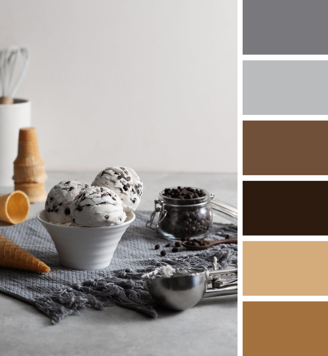
A minimalist color palette typically consists of a limited range of colors, often focusing on neutrals like white, black, gray, and beige. These colors are chosen for their timeless appeal and ability to create a clean, uncluttered look. However, minimalism isn't limited to neutrals; it can also incorporate muted, desaturated tones that add subtle depth without overwhelming the senses.
Key characteristics of a minimalist color palette include:
- Simplicity: The use of few colors to avoid visual clutter.
- Harmony: Colors that work together seamlessly to create a cohesive look.
- Timelessness: A focus on shades that don't go out of style, ensuring longevity.
- Subtlety: Gentle variations in tone and hue that provide interest without distraction.
The Psychology of Minimalist Colors
The colors in a minimalist palette are not just visually appealing but also have psychological benefits. Neutrals and soft tones are known to promote relaxation and mental clarity, making them ideal for environments where focus and tranquility are desired. Here’s a closer look at how specific minimalist colors impact mood and perception:
- White: Symbolizes purity, cleanliness, and openness. It can make spaces feel larger and more inviting.
- Black: Conveys sophistication, power, and elegance. It provides a strong contrast when paired with lighter colors, adding depth and definition.
- Gray: Represents balance, calm, and neutrality. It's versatile and can range from light, soothing shades to darker, more dramatic tones.
- Beige and Earth Tones: Evoke warmth, comfort, and natural beauty. They create a grounded, welcoming atmosphere.
Applications of Minimalist Color Palettes
-
Interior Design: Minimalist interiors are characterized by clean lines, uncluttered spaces, and a restrained color palette. Walls, furniture, and decor in shades of white, gray, and beige create a serene and sophisticated environment. Accents in black or muted colors add depth and interest without overwhelming the space. This approach not only enhances the aesthetic appeal but also promotes a sense of calm and order, making homes and offices feel more comfortable and functional.
-
Fashion: In fashion, minimalist color palettes are embraced for their versatility and elegance. Clothing in neutral tones like white, black, and gray can be effortlessly mixed and matched, creating timeless and chic outfits. This simplicity allows for the quality of the fabric and the cut of the garment to take center stage. Minimalist fashion often focuses on high-quality materials and impeccable craftsmanship, resulting in pieces that are both stylish and enduring.
-
Graphic Design: Minimalist color palettes in graphic design emphasize clarity and readability. By limiting the number of colors, designers can create clean, impactful visuals that communicate messages effectively. Websites, logos, and print materials using minimalist palettes often feature ample white space and simple typography, allowing the content to shine. This approach is particularly effective in creating a professional and modern aesthetic.
-
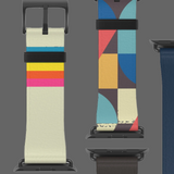
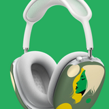
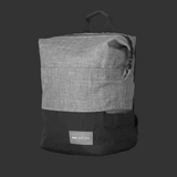
Product Design: Products designed with a minimalist color palette often appeal to consumers looking for sleek and functional items. Electronics, home goods, and even vehicles benefit from the simplicity and elegance of neutral colors. This design philosophy ensures that the product remains visually appealing over time and fits seamlessly into various environments.

Creating a Minimalist Color Palette
Developing a minimalist color palette involves careful selection and a keen eye for balance. Here are some steps to create your own minimalist palette:
- Start with Neutrals: Choose a base of white, black, or gray. These foundational colors will form the backbone of your palette.
- Add Complementary Tones: Introduce softer shades of beige, taupe, or muted pastels. These colors should harmonize with your base and add subtle variety.
- Limit Bold Colors: If you wish to include bolder hues, select one or two that provide contrast without overpowering the palette. Deep navy, forest green, or burnt sienna can add interest while maintaining a minimalist feel.
- Focus on Tone and Texture: Incorporate different tones of your chosen colors and vary the textures to add depth and dimension without using additional colors.
The Future of Minimalist Color Palettes
As society becomes increasingly aware of the importance of mental well-being and sustainability, the principles of minimalism continue to resonate. Minimalist color palettes, with their focus on simplicity and timelessness, align perfectly with these values. They encourage mindful consumption and a return to quality over quantity, fostering environments that are both beautiful and functional.
In conclusion, the minimalist color palette is a powerful tool in the hands of designers across various fields. Its emphasis on simplicity, harmony, and subtlety creates spaces and products that are not only aesthetically pleasing but also promote a sense of calm and order. Whether in interior design, fashion, graphic design, or product development, the minimalist color palette stands as a testament to the enduring beauty of simplicity.


