


The Story of PANTONE Colors
In a world filled with countless hues, shades, and tones, the name PANTONE stands out as a beacon of color consistency and standardization. From fashion design to graphic arts, interior decor to product branding, PANTONE colors have become an integral part of the visual landscape. But how did this iconic system come into being, and what has propelled it to such universal prominence?
The story of PANTONE begins in the 1950s with Lawrence Herbert, a young chemist working at a company that manufactured colorants for the printing industry. Herbert noticed the inherent inconsistencies in color reproduction across different materials and printing techniques. This lack of standardization led to frustrations and inefficiencies in the industry, as designers and printers struggled to communicate and reproduce colors accurately.

Inspired to address this issue, Herbert purchased the company's color division in 1962 and set out to revolutionize the way colors were identified and reproduced. His vision was to create a universal language of color, a standardized system that would allow designers, printers, and manufacturers to communicate seamlessly across industries and continents.
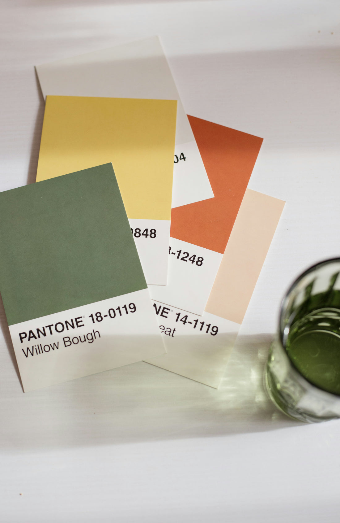
In 1963, Herbert introduced the PANTONE Matching System (PMS), a proprietary color space that assigned unique numerical codes to thousands of standardized colors. Each color was carefully formulated using precise mixtures of base inks, ensuring consistent reproduction across various materials and printing processes. This revolutionary system provided designers with a reliable reference point, enabling them to specify colors with unparalleled accuracy.
One of the key innovations of the PANTONE Matching System was its ability to transcend the limitations of traditional color models. While systems like CMYK (Cyan, Magenta, Yellow, Black) and RGB (Red, Green, Blue) were suitable for specific applications, they lacked the versatility and consistency required for professional design work. PANTONE colors, on the other hand, offered a comprehensive palette that could be easily translated across different media and substrates.

The introduction of the PANTONE Matching System marked the beginning of a new era in color communication. Designers and printers embraced the system wholeheartedly, recognizing its transformative impact on their workflow and creative output. With PANTONE colors, they could now confidently select and reproduce colors with precision, eliminating the guesswork and variability that had plagued the industry for so long.
As the PANTONE Matching System gained widespread adoption, its influence extended beyond the realm of print and graphic design. Industries ranging from fashion and textiles to plastics and packaging began incorporating PANTONE colors into their products and branding efforts. The standardized color codes provided a common language that facilitated collaboration and innovation across diverse sectors.
Over the years, PANTONE has continued to evolve and expand its color offerings to meet the evolving needs of the design community. New color guides and swatch books are regularly introduced, featuring updated palettes inspired by emerging trends and influences. The company has also embraced digital technology, developing software and tools that enable designers to work with PANTONE colors in a digital environment.
In addition to its commercial success, PANTONE has become a cultural phenomenon in its own right. The annual announcement of the "PANTONE Color of the Year" has become a highly anticipated event, eagerly awaited by designers, trend forecasters, and consumers alike. Each year, the chosen color reflects current societal trends and influences, serving as a symbolic representation of the collective mood and aspirations of the time.
Beyond its practical utility, PANTONE colors have a profound emotional resonance, evoking memories, associations, and sensations that transcend language and culture. Whether it's the vibrant red of a Coca-Cola logo or the soothing blue of a Tiffany & Co. box, PANTONE colors have the power to convey meaning and evoke emotions in ways that words alone cannot.
In conclusion, the story of PANTONE is a testament to the transformative power of color in our lives. What began as a humble effort to standardize color reproduction has blossomed into a global phenomenon that touches virtually every aspect of design and aesthetics. As we continue to navigate an increasingly visual world, PANTONE colors serve as a guiding light, illuminating our creative endeavors and enriching our shared experiences.


