10 Fascinating Facts About PANTONE Colors
PANTONE colors have become synonymous with precision, creativity, and style in the world of design. From fashion runways to product packaging, these standardized hues have left an indelible mark on countless industries. But beyond their aesthetic appeal, there's a wealth of intriguing information about PANTONE colors that many may not be aware of. Let's delve into 10 fascinating facts that illuminate the colorful world of PANTONE:
- The Brainchild of a Chemist: PANTONE owes its inception to Lawrence Herbert, a young chemist who recognized the need for standardization in color reproduction. In 1963, Herbert introduced the PANTONE Matching System (PMS), revolutionizing the way colors are identified and communicated in the design industry.
- Universally Recognized: PANTONE colors are utilized across the globe as a common language for designers, printers, and manufacturers. This universal standardization ensures consistent color reproduction regardless of geographic location or printing technique.
- Color of the Year: Each year, PANTONE selects a "Color of the Year" that reflects current trends and societal influences. This highly anticipated announcement sets the tone for design trends in fashion, interior decor, and graphic design for the year ahead.
- Beyond Print: While PANTONE colors are often associated with print and graphic design, their influence extends far beyond the realm of paper and ink. Industries such as fashion, textiles, plastics, and cosmetics incorporate PANTONE colors into their products and branding efforts, leveraging the system's versatility and reliability.
- Precise Formulation: PANTONE colors are meticulously formulated using precise mixtures of base inks to ensure consistent reproduction across various materials and printing processes. This attention to detail allows designers to specify colors with unparalleled accuracy.
- Cultural Significance: PANTONE colors have transcended their practical utility to become cultural symbols in their own right. Iconic brands such as Tiffany & Co. and Coca-Cola have adopted specific PANTONE shades for their logos, imbuing these colors with rich cultural meaning and associations.
- Color Psychology: The psychology of color plays a significant role in design, marketing, and branding. PANTONE colors are chosen not only for their visual appeal but also for the emotions and associations they evoke. From calming blues to vibrant reds, each color tells a story and elicits a distinct emotional response.
- Digital Integration: In response to the digital revolution, PANTONE has developed software and digital tools that enable designers to work with PANTONE colors in a digital environment. These digital solutions provide greater flexibility and efficiency in color selection and communication.
- Color Trends Forecasting: PANTONE employs a team of color experts who analyze global trends in fashion, art, design, and culture to forecast future color trends. This meticulous process involves observing emerging color palettes and societal shifts, providing invaluable insights for designers and businesses alike.
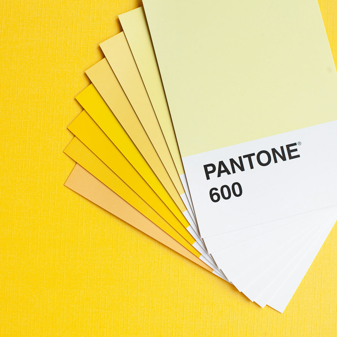
- Continual Innovation: Despite its longstanding legacy, PANTONE remains at the forefront of color innovation. The company regularly updates its color guides and swatch books to reflect evolving trends and influences, ensuring that designers have access to the latest and most relevant color palettes.
In conclusion, the world of PANTONE colors is as vibrant and dynamic as the hues it encompasses. From its humble beginnings as a standardized color system to its enduring influence on global design trends, PANTONE continues to shape the way we perceive and interact with color in our daily lives. Whether it's the announcement of the Color of the Year or the meticulous formulation of each shade, there's no denying the fascinating allure of PANTONE colors and the colorful stories they tell


